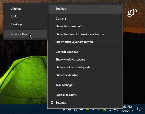
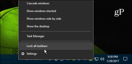
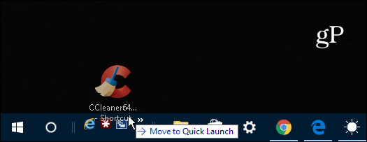
While it’s not included in Windows 10 by default, you can still add it manually by following the steps in this article.
Add the Quick Launch Bar to Windows 10
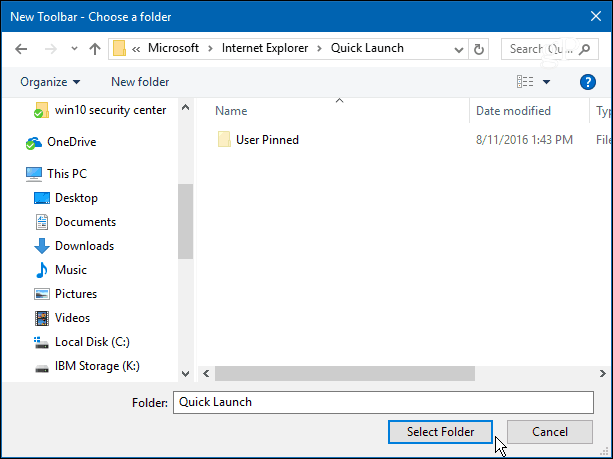
Or, to make things easier, copy and paste the following path into the File Explorer address bar and hit Enter and click the Select Folder button: %appdata%\Microsoft\Internet Explorer\Quick Launch
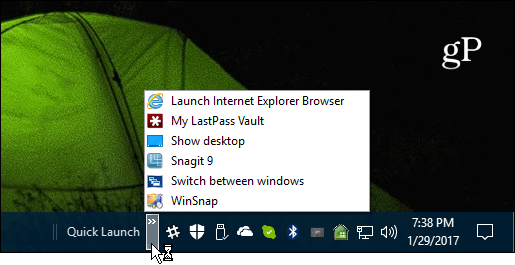
If you add several items, just click the arrow icon to bring up the list items you have in the bar. And, if you’re still running Windows 7 and would like to get the Quick Launch bar back check out our article here.
What’s your take? Do you like the new user interface of Windows 10 or do you prefer the familiarity of Windows 7 or earlier? Leave us a comment and let us know your thoughts. Thanks for that ‘How to’ Under XP I used to have a number of ‘toolbars’ at the top of the screen so they were a set of autohidden drop-down shortcuts or links to folders. So much easier to organise work and play as XP spread them across the screen width but let you adjust the boundaries between each set – so the set could have an ‘ID’ entry at the top such as “Logic” “Shootem” “War” “Office” “project1” “project2” “Backup” “Progress” “Followup” “Read-me” Meant that the desktop was without clutter and no need to minimise the apps in order to get at a folder shortcut in one of the blocks of icons kept on the screen for follow-up etc.- And for the most frequently used normal days activities and apps – there was the right hand side of the screen for a column of icons Yes – really useful so it had to be taken away from users in the following windows release .. https://sourceforge.net/projects/linkbar/ So – not a bad facility, and may be of use, but definitely lacking the usefullness of the Windows-XP one – That allowed me to have sets of links for a number of ‘projects’ along the top with the entries of a project as dropdowns and sets of apps down the side. So – back to the folders of shortcuts with links to those folders in a toolbar (pop-up) list from a link on the taskbar – Those I can push to the right and stack when I have a multi-row taskbar setup. BUT – I am still considering if I should uninstall the Linkbar facility, or keep it onscreen. Back to looking for a facility where I can have a ‘folder’ of entries for a ‘project’ or set of activities (per client perhaps) that can be shown in the same way as the desktop – as in grouped in areas according to their need for use or attention – do now -(centre bottom) do next -(centre middle), tidy-up -(centre top), done -(bottom right) deal with when I can, -(top right) process is do-these-in- turn, -(left from top down) New incoming, -(centre right) Also iirc linkbar doesnt have to option to autostart but that can easily be worked around. To make an autostart entry
- Go to run (windows key + r) then type : shell:startup then press enter in keyboard. A folder should pop up and you can then create a shortcut of the linkbar program and place the shortcut in there and it will automatically start when windows loads. Secondly, trying to move other pinned items on the TB does not work either as no message “move to QL” appears. I had hoped to remove Edge from the TB and keep it and other browsers on the QLB but as mentioned, no success. There are a few other items that I pin but don’t use much that would be nice to be able to hide on the QLB but have easy access to when required. This would free space on the TB which is handy if more items are required on the TB and one does not want to use the up/down arrows to access those items on an overly crowded TB. For access to other programs, I do use a lot of folders and add them to the DT toolbar and hide the regular DT so it is clean of my background photo of my wife. I have used this method of accessing programs for many years (since the advent of IE 4 which allowed for this process) I was just thinking that to have the ability to access from a flyout menu using QLB items of like ilk such as browsers, digital image programs etc it would be handy and free up space on the TB. I have not rebooted in a bit and when I do, I might find that I can then move the QTB and then be able to do what I want. It also would be useful to store less used but wanted for ease of access some items not used on a daily basis. Even then I forget I have some items sitting in front of me such as clipping and sticky notes as they don’t get used a lot but I prefer them on the TB rather than on the DT Toolbar. Comment Name * Email *
Δ Save my name and email and send me emails as new comments are made to this post.
![]()
